CSDS – Exploring Semantic Web Collections

Introduction

The Semantic Web focuses on producing a Web of linked data. The technologies used in the Semantic Web enables people to produce vocabularies and define specific rules of how such vocabularies are meant to be used. These rules will then help the computer produce inferences of how such data is linked, thus producing more accurate datasets. A growing number of Cultural Heritage organisations are now the new standards of linked data as the main infrastructure to support their collections. There is a wide range of data models or vocabularies such as CIDOC CRM, Dublin Core and Europeana Data Model (EDM). In this workshop we will focus on exploring collections under the Europeana repository and the EDM. Europeana currently holds billions of records from over 4,000 heritage organisations such as galleries, libraries, archives and museums (GLAM) among others. There are many challenges of how such collections are meant to be explored, such as the use of SPARQL querying languages. This workshop will introduce participants to the Semantic Web, and how to query such Linked Data collections. Finally, this session will use Europeana’s API to produce query interfaces to explore those collections, using the data model and producing some visualisations.

Timetable

10.30: Welcome and Introductions

11.00-11.45: Introduction to the Semantic Web. New Challenges in Cultural Heritage

11.45-12.15: Coffee Break

12.15: Understanding Data Models (open taster lesson)

Querying the Semantic Web (Heritage)

The Europeana Data Model through SPARQL

1.30-2.30: Lunch

2.30: Querying through APIs (Europeana)

Advanced API Queries (bonus lesson)

* Interaction Development

Developing Interfaces for Exploring Information through APIs

* Further Visualising the Data

Introduction to JQuery UI

Implementing JQuery UI

4.00-4.30: Coffee Break

4.30-5.30: Interaction and Exploration (Tangible User Interfaces) — Potential

Final Output TUIO//Europeana

08. Introduction to TUIO

09. TUIO First Query

10. Final Build


Requirements

Most of the work we will produce uses Open Source tools, and it does not require much computer resources.

To test some API calls you can download Postman.

https://www.getpostman.com/

We will be working with data from Europeana. Make sure you register for an API Key here:

https://pro.europeana.eu/get-api

You will need to work with some HTML, CSS and JavaScript (JQuery), therefore a nice scripting/programming text editor can be handy. On MacOSX, I use TextMate (https://macromates.com/), for Windows or Linux many people use SublimeText (https://www.sublimetext.com/).

Finally, we are going to build some quick Tangible queries using ReactiVision (http://reactivision.sourceforge.net/), you will need a webcam for this. If your computer already has one, that will work fine. Otherwise, any USB webcam will work fine as well. ReactiVision also provides an emulator that we can also use to prototype interfaces. Finally, we are going to be testing some of these tools on the Web in a non-standard way. For the sake of the experiment, you will need to install a legacy version of Firefox. This is because Firefox has currently disabled the option of installing plugins, that enables us to connect to ReactiVision. Please go to https://ftp.mozilla.org/pub/firefox/releases/ and scroll down to Dir 48.0.1 (Firefox 48) and install that version on your Mac or PC computer. Finally, make sure you can have access to the Web on the computer you are going to use.

Ten Years of Design and Mexican Politics

As a Mexican I have been strained to live in different parts of the world. One thing that I have noticed, is that there is there is a growing nationalistic appreciation for your country of origin every time you have to live abroad. Arguably, this phenomena takes place in the vast majority of immigrants of every single country, including Mexico. There is an intrinsic sense of belonging that we crave as humans, as members of the world.

Many of students at universities create a wide range of societies to convey to other people their particular convictions and/or interests. These can range from political, social, sports, or even cultural. In this case I will be focusing on the Mexican Society at the University of Southampton (MexSoc). This society was originally created (to my best understanding), to support Mexican and other spanish speaking students at the University, as well as promoting Mexican culture.

There has been a huge change in this society from the time I met them from the first time in 2006, until the last time I saw them in 2016. In addition, the Mexican society demographics changed throughout time. Nevertheless, as mentioned before, there is always a sense of belonging as a society, as Mexicans, as Latin-Americans and as students.

Among many of the different events that the MexSoc, many of them cultural, such as the Day of The Dead Altar, MexSoc Seminars, MexSoc Cinema and Political Discussions. In addition, there are also social events, such as the parties to celebrate some of the main Mexican holidays. Originally, I was not part of the University since I was teaching in another university. Therefore, the way I was able to collaborate with the MexSoc was through producing the designs for their events.

In a way, these designs describe the foot prints of what has been going on in Mexico.

mexsocposters

These posters will be described in chronological order.

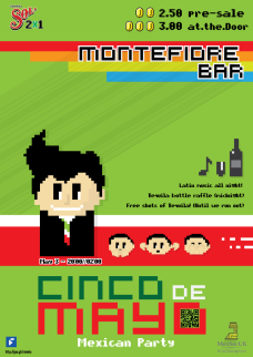
posterlowresMay, 2014. Party Cinco de Mayo

During this time, the government had noticed that social network technologies could empower social discourse and demonstrations. For this reason, the government began to censor how the internet was going to be used in Mexico. Among many of the dramatic changes proposed, were the power to discontinue internet access and other telecommunication services whenever a ‘competent authority’ required so. This article 197 and 145 called for a full censorship of the Web, and there were even scenarios where demonstration where pages such as the 1DMX were taken down.

This poster depicted such censorship on the Web, a Web where Mexicans were not allowed to talk, hear or see anything that was nor previously approved by the government.

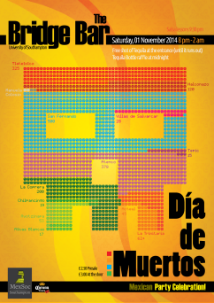
muertosNovember, 2014. Dia de Muertos

The assassination kidnap of the 43 students in the state of Iguala, Mexico had become a trending topic. Massacres in Mexico carried out by the government have been a recurrent strategy, that showcases the impunity and ineptitude of the government and public servants. Arguably, even Mexican academics tend to forget their (our) own history. There has been numerous mass killings in hands of the government such as the one in Tlatelolco, Atenco, San Fernando and Acteal. Ironically, people seem to have forgotten that the current president was the governor of Estado de Mexico (Atenco), where one of the most recent human rights violations took place. The data used for this poster represents only official government interventions.

This poster is a simple data visualisation of the total number of people killed in individual events. Each dead person is depicted with a skull and they are arranged together so it looks like a skull. The colours, and visuals of the poster emulates the papel picado technique used to ornate the altars in Mexico.

infras3May, 2013. Cinco de Mayo

When the current president of Mexico came in to power in December 2012, he already had a trajectory of abuse of power, corruption and negligence. It was a president, which arguably, risen into power thanks to the poorest 10% of the population, which at the same time is the core vote of his political party, PRI.

The emblematic president had already been called out as ignorant due to his interview at the International Book Fair in Guadalajara, where he was not able to mention three books that he had read, and confusing the authors of some of the books that he ‘allegedly’ read. Those news became viral, but not at much as the video of him giving a presentation in english at the World Future’s Society in 2008. No wonder he used an interpreter at the White House when he met with Obama as the ‘elected president of Mexico’.

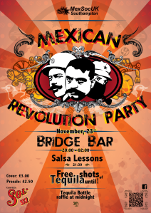
revoNovember, 2013. Revolution Party

During this time the Mexican congress approved the privatisation of Mexican oil. This billion worth business was applauded outside Mexico, where many of them indicated that this was a sign of hope. Beyond, the media influence of such topics, it was expected that transnational companies would begin to pay attention to such opening in the market. Companies such as Exxon, Chevron and Petrobras showed their interest in this neoliberal process.

This year’s poster depicts, yet again, that privatisation process that Mexicans seem to forget over and over again. Now in 2017, we can already see who are the main beneficiaries of such transactions. The poster shows an image of Villa, Zapata and Marcos to highlight that the revolution process is still yet ongoing and very present. In addition, there are two ornaments: an Aztec on the left and a Mayan on the right. This aimed to include the diverse ranges of cultures, where although there are over 20 different cultures, it acknowledges that Mexico is not just conformed by Aztec culture. For this reason, it was decided not to use the traditional eagle and include these indigenous icons. To remind the audience about the privatisation process, the background is made of a pattern of Pemex, and other transnational oil companies, such as Exxon and accompanied with the emblem of the European Union, which hosts many of the companies that thrive on developing economies.

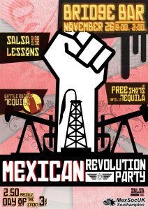
posteNovember, 2011. Revolution Party

The privatisation of Mexico’s natural resources seem to be a topic that tends to come up over and over. In fact, this is a topic that has been under discussion since the 1990s (Salinas-Zedillo terms). The long battle to privatise PEMEX seemed to be fought by a semi-united left. In hindsight, this also showcases how quickly the left disappeared in the Mexican politics.

During this time PEMEX accounted for 10% of the export revenues of the country with a $80.6 billion in revenue. The current political party in power, PRI, needed to have the connection to liberalise PEMEX and they finally got it in this current term with Enrique Peña Nieto. It has been argued that this is a common strategy plan to privatise state companies; break them and then sell them, or in this case call for investors such as Halliburton.

This poster aimed to rise the awareness that the oil privatisation was an ongoing deal. The illustrations depict the fight for the Mexican oil. The background shows a carved print from WWII made by the Taller de Grafica Popular,  that calls for the removal of fascism and applauds the victory of US and GB over the Nazis. In addition, the background also displays a small high contrast image of Zapata, to remind us that we are still being overpowered by fascists ideologies through transnational companies.

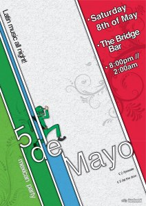
cartelmexconmonoMay, 2010. Cinco de Mayo

For some reason, the MexSoc had already established the 5th of May as one of the established parties at the university. Mexicans do not really celebrate this date as much as Chicanos (Mexican Americans). The 5th of May celebrates the Battle of Puebla. When ex-president Benito Juarez came to power (1806-1872), he was left with a Mexico in financial ruin and owed money to Europe. Britain, Spain and France sent naval forces to Mexico, where negotiations were only agreed with Spain and Britain. France carried out the attack with 6,000 troops under General Charles Latrille de Lorencez. Juarez gathered only 2,000 troops, where many of them came from indigenous background. General Ignacio Zaragoza, a man born in Texas, came up with a victory in Puebla, where France reported over 500+ casualties. The Mexican army reported less than 100 deaths. This date was later picked up and made popular by Chicano activists in the 1960s in the United States. They used the analogy of the victory of the indigenous people over Europeans. Now, the Cinco de Mayo celebrations are very important for many Mexican-Americans and Latin-Americans-Americans (Latino Community) in the United States.

This poster aimed to reiterate that Mexicans do not celebrate Cinco de Mayo, but the anniversary of the Battle of Puebla. The poster depicts a dancing Mexican army soldier dancing and smiling. He is currently wearing a wrestler’s mask in a kitsch combination of modern and past. The design and colours of the poster merge the French and Mexican flag colours. The overall design and ornaments were based on Art Deco style to depict France’s heritage in Mexico. It is an attempt to bring Cinco de Mayo back to its roots.

But not all of it is bad news.

Throughout these years, Mexico has seen a large range of changes in their economic policies, political corruption, and thanks to the World Wide Web, we are able to gather more information and evidence from politicians. Overall, what I can personally recognise is the disappearance of the Mexican Left and the immense connections that new PRI generations of politicians bring under their arm. Nevertheless, it is not all gloom, there is a growing number of Mexican scientists (not me), who are becoming world leaders in their fields. Many of them in Mexico, and many of them in other parts of the world. But if one thing is clear, is that when Mexicans get together, good things happen.


Designing a Scientific Poster (Part 02)

Part 02. Layout and Design Issues

Layout.

There is going to be several ways to arrange and layout the content of our poster, but there is going to be several key elements that we don’t want to look over before making any decisions of where to place our objects.

Reading Process

By default at least in non-Oriental cultures, we will start reading from left to right and then from top to bottom. That is why we have to be very clear the way we arrange our elements and the spacing between them.

In this example on the left we can see how a simple landscape page can be divided into four quadrants, showing us the reading sequence of our audience. This means that the first area in where our audience will look for information will be the quadrant no.1

Now that we know that the audience will start on the top-left of the page, then we can start to sub-divide our content depending on the amount of information and type of imagery to be used.

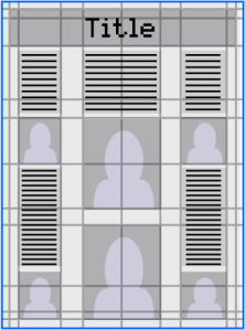
The illustration on the right shows us that now we have two main elements: The Title placed on the top left ant the rest of our quadrants placed right after the title, allowing us now to subdivide the rest of the page into sections, which will be containing the rest of our elements..

When we start defining the positions of the elements on our poster, remember to be creative! Perhaps you want to start by sketching some ideas or placements of your elements before you even start creating the layout or placing the elements on the canvas.
Remember we already had placed the title on the top.

Grid for the Layout.

The grid can become a very helpful ally that will guide us to divide the spaces of our canvas, that way all we have to do is place the elements on the cells of our grid.

The first thing we have to do is to start sub-dividing on a continuous division of the canvas in the ratio 1:1414. Using our canvas as a guide, we can maintain the proportion throughout the grid, this will give our design elements a relationship towards the paper size and the grid. By using the size of the paper as a guide we can divide using that ratio to begin creating the grid.
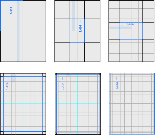
GridsTrinker

Try1

Placing the elements.

At this moment we have divided our canvas into several cells and columns. Now is the time for us to start placing our elements. At first, looking at the grid, it seems quite contradictory to have creativity on what it seems to be such a rigid layout. The grid systems will help by providing a framework and recommended positions for our elements. Remember at any moment you can sub-divide even further any of the areas of the grid that you already have. Experiment with your elements but keep in mind the sequence for your information.

Approximate size: 1m X 1m
Number of parts: 10 maximum
Lines per part: 10 – 20 maximum

Typography.

Type is one of the most important elements, not only for the final aesthetic result but also to provide the a better accessibility to the information.

There are two main concerns related to type:

  • Readability
  • Legibility

Readability is the result of the complete process of presentation of the text material in order to communicate the message clearly. Readability will relate to a whole paragraph or sentence, a text as a whole and its accessibility

Legibility focuses on each individual character or glyph making sure it is distinguishable from all other characters in the font. Legibility is including on the design process in which we pick the appropriate typography that is not only easy to read or to identify, but also that contains the personality that we are looking for.

We have to take these two concepts into consideration while we are introducing type to our poster, since there are going to be several elements that will affect either the readability or the legibility of our text.

tont

Avoid using serif fonts for the title, but is recommended to use them on the main body of your text.
Do not use bullets on your main headers, use bold type and follow a proper hierarchical sequence for headers and sub-headers.
The width of the text boxes should be approximately 40 characters, having on average 11 words per line.
Avoid blocks of text longer than 10 sentences.
Do not underline, use italics instead.fontcolor
Avoid using dark backgrounds or element saturated backgrounds.

Recommended fonts:
Titles: Helvetica, Arial, etc..
Body of text: Times New Roman, Palatino, etc…

Sizing, it is recommended to use the font size to 40pts. This is because we have some considerations towards the audience:

Poster reading time: 2 minutes
Distance to be read: >2 meters

Colour.

Although colour can enhance the content of our elements, it can also work against us. We have to be aware which combination of colours we are going to be using so we won’t affect either the legibility or readability of our text content and make it friendly and appealing to our audience at the same time.

We already have some typography based restrictions for the colour. Now, we will get more into detail to check what are going to be our best options.

Contrast.

In typography, colour contrast its what is going to make it stand out. Here are some examples and recommendations for the colour contrast:

contrast

This is an example of how colour contrast is used to stand out text. Red text over the white background jumps out from the screen straight away, meanwhile the dark colour sits more quietly enclosing the whole concept.
Using white or a light colour is easier to deal with, since it is a very noble or friendly color, which allows us to combine it easily.
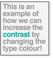
contrast2

Another option would be by changing the colour of the type. This will allow also some words to stand out, without disturbing the rest of the content. Although we will be using a colour change on the type, it is recomended to continue with a simple pattern or stick to the color swatch that we will define for the poster.

After these examples we can start experimenting a little bit more and perhaps use colour and contrast to enhance the visual appeal of our text or titles by using our basic colours from our colour swatch defined for our poster.

contrast

Choosing the colour palette.

There are several tools that we can use to pick the basic colour paletes or swatch collections for our designs. But firs of all lets understand which colours will work best for our readability and legibility according to how they relate or how much contrast they generate in between them.

The first thing we need to do when we picking a colour palette is to define a theme. This theme of course has to have a personality, which at the same time is directly related to a colour. We will pick that colour and then apply the several colour combination rules, which are:

  • Analoguous
  • Monochromatic
  • Triad
  • Complementary
  • Compound
  • Shades

Lets imagine we will be presenting a poster related to the ocean. As we know on a big scale the most predominant colour is blue. Now, lets use that colour and start applying some combination rules…
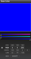
color

There is an free web application created by Adobe called Kuler. This application is also in Photoshop CS4. What this application does is to help us to device colour schemes through the several color theory rules.

If you load the Adobe Kuler application, go to Create – From a Color and then pick the base colour.

We will start by picking the blue colour, wich contains 100%Cyan, 100%Magenta, 0%Yellow and 0%Black. Now all we have to do is to pick the rule that we want to apply. Make sure once you pick a rule to apply as your colour scheme, don’t start combining other color into the main colour scheme of your design.
On the bottom of the colour swatch, you will be able to see the RGB, CMYK, HSV, Hex and LAB colour values, so you can be able to apply this colours properly if you need to present your poster as a digital version on the web or any other digital media output.

Analogue Rule.

analogue

Monochromatic Rule.

monochromatic

Triad Rule.

triad

Complementary.

compleme

Compound.

compound

Shades.

arrow

Part 01 – Basic Concepts (Scientific Poster)

Bibliography.

Block, S. 1996. The DOs and DON’Ts of poster presentation. Biophysical Journal 71:3527-3529

Briscoe, M.H. 1996. Preparing Scientific Illustrations: A Guide to Better Posters, Presentations, and Publications, 2nd ed. Springer-Verlag, New York

Advice on designing scientific posters. Colin Purrington, Department of Biology, Swarthmore College, Pennsylvania

Alley, Michael, The Craft of Scientific Presentations (New York: Springer-Verlag, 2003), pp. 211-217.

http://www.writing.engr.psu.edu/posters.html

La alegría de publicar 3. Las presentaciones de carteles en congresos científicos. Carlos Alfonso Reyes, M.D.1, Guillermo Llanos, M.D

Five simple steps to designing grid systems, Mark Boulton

Recomendaciones en la elaboración de un cartel.

Color and Typography in Good Desing, ColourLovers.

Requisitos Para Carteles. UAM, Mexico

Readability Test, Juicy Studio.

Designing a Scientific Poster (Part 01)

Part 01: The Content

Defining a Poster.

A poster is a graphic material devised to deliver a message, it integrated as an aesthetic unity by high impact images and brief text. The message of a poster has to be global integrating each one of the elements in a single blended aesthetic unit.

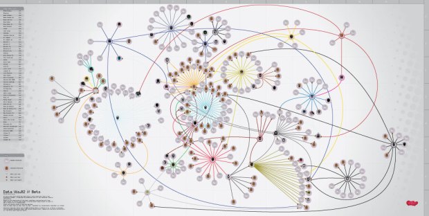
DataVis02//JavierPeredaTrinker

There are two types of posters: Informative and formative.

The Informative Poster, is meant to communicate events, conferences, courses, social reunions, shows, etc.

The Formative Poster, is used as a channel to inform the audience about a specific topic or even explain activities.

The Scientific Poster.

The scientific poster is a formative poster. As we know already, the poster is meant to communicate a message Through the scientific poster, we will be presenting work to an audience who could be on a hall, an exhibition or even on the outdoors. It is common for the presenter to be standing next to the poster allowing and inviting the audience to engage into one-on-one discussion about the message or in this case the subject presented. Some exhibitions will require the poster to be standing alone, this means the presenter will not have the opportunity to explain the content or to establish any direct conversation with the audience, which will make the information fully dependable from the poster.

Quick contents for the poster.

  • Header
    • Title
    • Authors
  • Short description
    • Introduction
    • Methodology
    • Results
  • Discussion (optional)
  • Conclusion
  • Bibliography

Header.

Tilte.

  1. Make sure the title is the most visible text area of the poster.
  2. Do not use capital letters for all the typeset.
  3. Try to use short words (of, from, with, an, and and) to separate details in the title, and it is correct not to capitalize these words.
  4. It is recommended to locate the title on the top.
  5. The Authors can be placed just underneath the title.
  6. According to the kind of audience you are focusing, the title should be catchy in order to drag more interest.

Short Description.

We should try to make the audience recognize what is the poster about and of course its purpose; the audience should be able to do so within 20 seconds, so let’s try to keep it simple.

Introduction.

Do not include the abstract on the poster! Most of the time the abstract will be sent for different uses like: the conference catalog. Although this is not a rule, make sure you ask the organizers the requierements (if any) for the poster.

We will try to get the audience interested in the project straight away by providing only the essential information and definitions, and straight away place the issue in the context. This is also the perfect place to present your hipotesis and perhaps provide description and justification of general experimental approach. (200 words)

Methodology and Materials.

Briefly, describe your materials and methods, although remember this is not a manuscript, so, be brief. Use graphics or graphical ornaments to explain the experimental design if possible; use artistic visualizations to represent the experimental procedures. (200 words)

Results.

You will have to basic answers: Success or Fail. Make sure you mention at first whether the experiment worked and the details of it ( 90% of subjects survived ), and describe qualitative and quantitative results.

After this content proceed to show the data analysis that directly addresses the hypothesis; refer to data visualization design concepts. (200 words without legends )

Conclusion.

Discuss what are your results and their relevance. Perhaps explain how are your findings relevant to real organisms and future directions. (200 words)

Bibliography.

In this case is recommended to place the most relevant citations and sources from your project. Keep in mind that all content that has been quoted from other authors, needs to be properly acknowledged.

Part 02 – Layout and Design Issues

Bibliography.

Block, S. 1996. The DOs and DON’Ts of poster presentation. Biophysical Journal 71:3527-3529

Briscoe, M.H. 1996. Preparing Scientific Illustrations: A Guide to Better Posters, Presentations, and Publications, 2nd ed. Springer-Verlag, New York

Advice on designing scientific posters. Colin Purrington, Department of Biology, Swarthmore College, Pennsylvania
Alley, Michael, The Craft of Scientific Presentations (New York: Springer-Verlag, 2003), pp. 211-217.

http://www.writing.engr.psu.edu/posters.html

La alegría de publicar 3. Las presentaciones de carteles en congresos científicos. Carlos Alfonso Reyes, M.D.1, Guillermo Llanos, M.D

Five simple steps to designing grid systems, Mark Boulton

Recomendaciones en la elaboración de un cartel.